
Treat the booth as a spatial system
Repeat the Vanco mark at high-visibility touchpoints while allowing white architecture to give product content room to read.
Project spotlight · Concept views
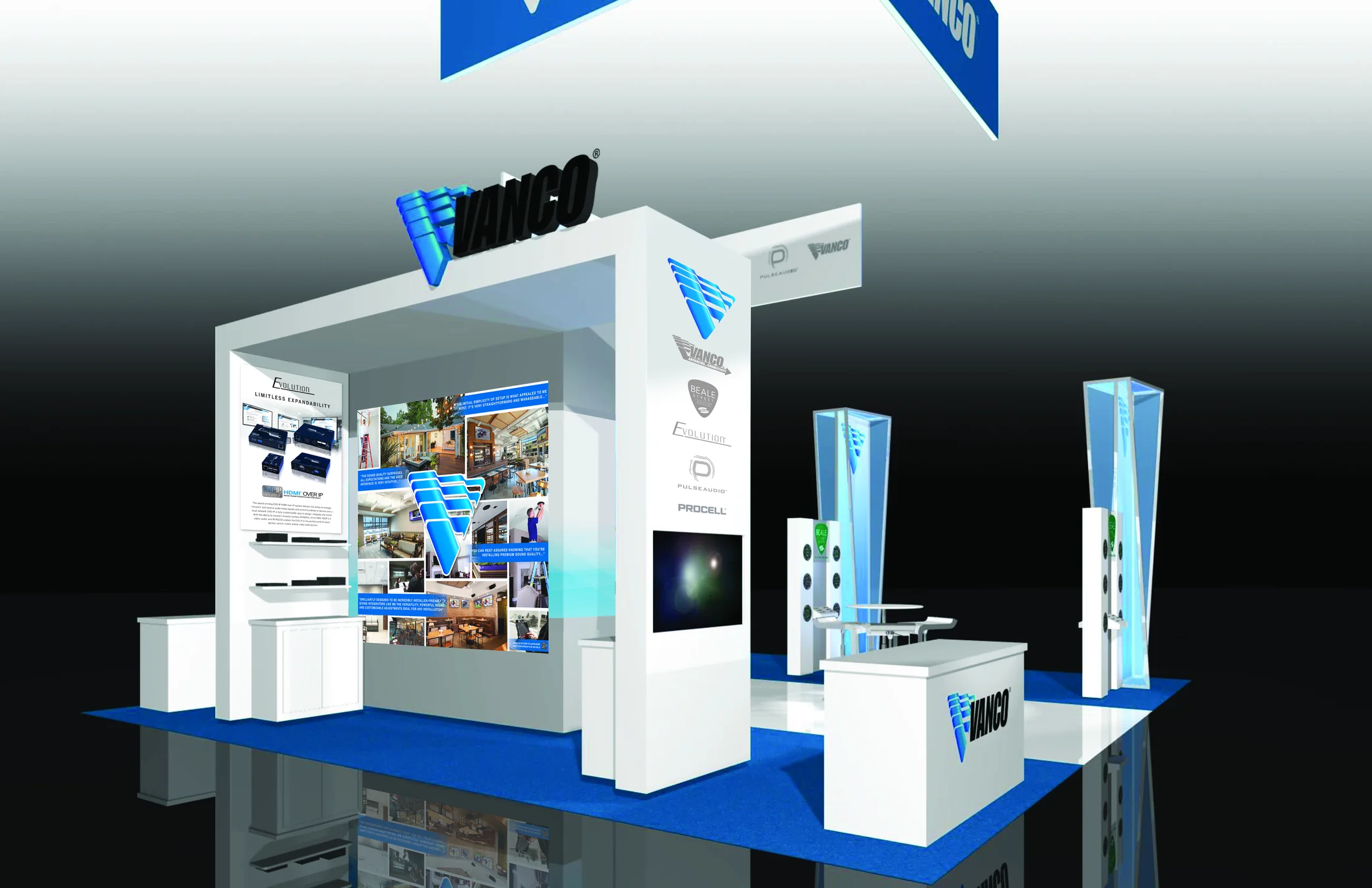
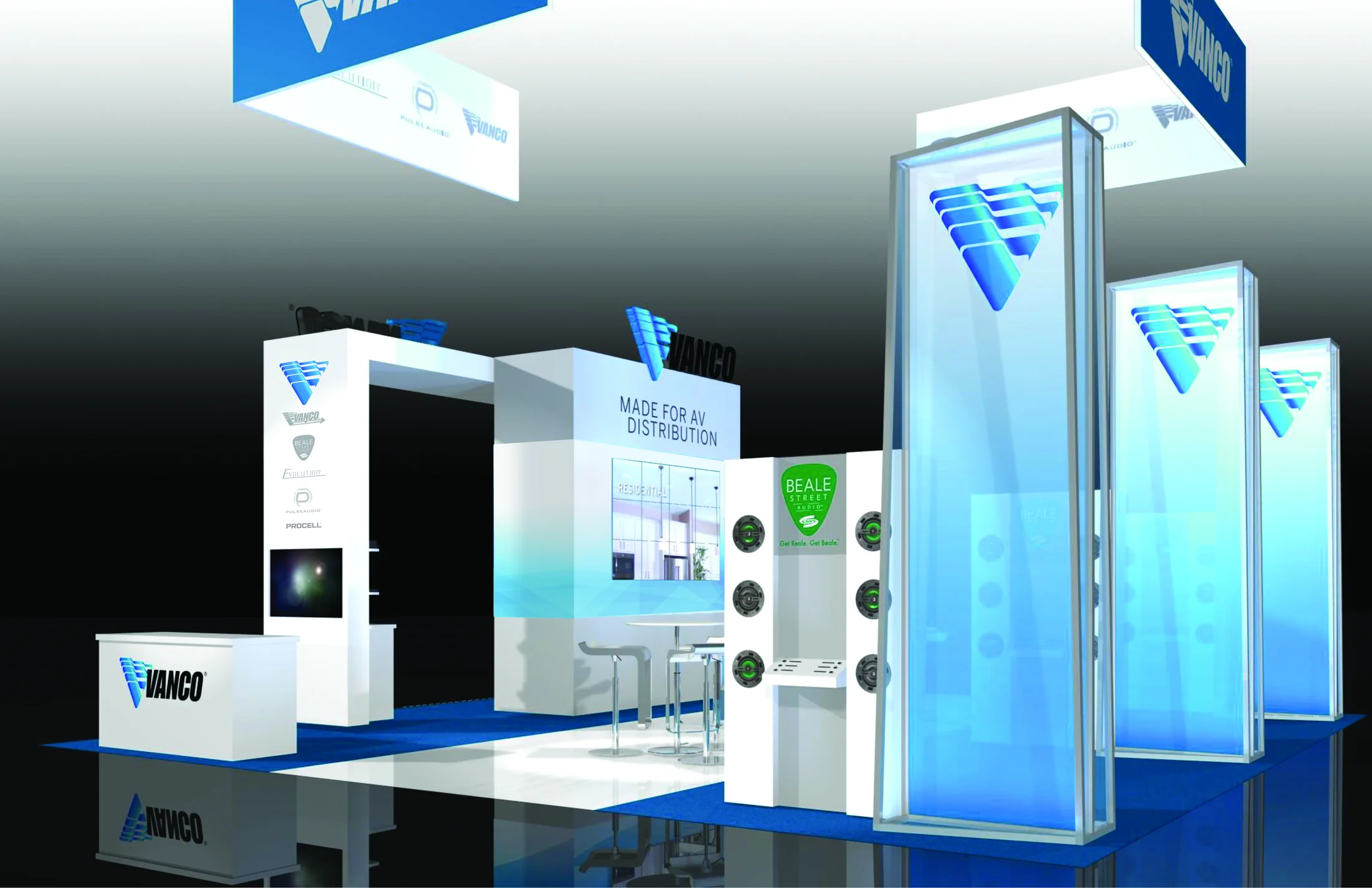
The supplied concept views present a coordinated CEDIA booth-graphics system with Vanco brand markers, product and partner-brand areas, illuminated towers, and presentation surfaces working in one environment.
Project context · 01
Trade-show work asks a brand to perform across different distances. Visitors need to recognize the company from across the aisle, orient at the edge of the space, and find useful product information once they step in.
The available source material documents concept views and finished graphic artwork. It does not establish an installed exhibit, attendance, leads, sales, event dates, budget, or other performance results.
The assignment · 02
The system needed to balance three visible jobs: establish a clear Vanco presence, organize multiple product brands and display areas, and use color, scale, and repetition to make separate booth elements feel connected.
Repeat the Vanco mark at high-visibility touchpoints while allowing white architecture to give product content room to read.
Organize product and partner brands as secondary identifiers so the broader offer remains present without displacing the primary identity.
Move from overhead identity to approach-level structures and then to detailed product-information panels.
Observable output · 03
CEDIA booth-graphics concept views from complementary angles.
Elevated Vanco identification for the overhead sign, counter, entry structure, and tower elements.
A modular product and partner-brand hierarchy across display walls and demonstration areas.
Environmental color and graphic treatment connecting structure, floor, signs, and panels.
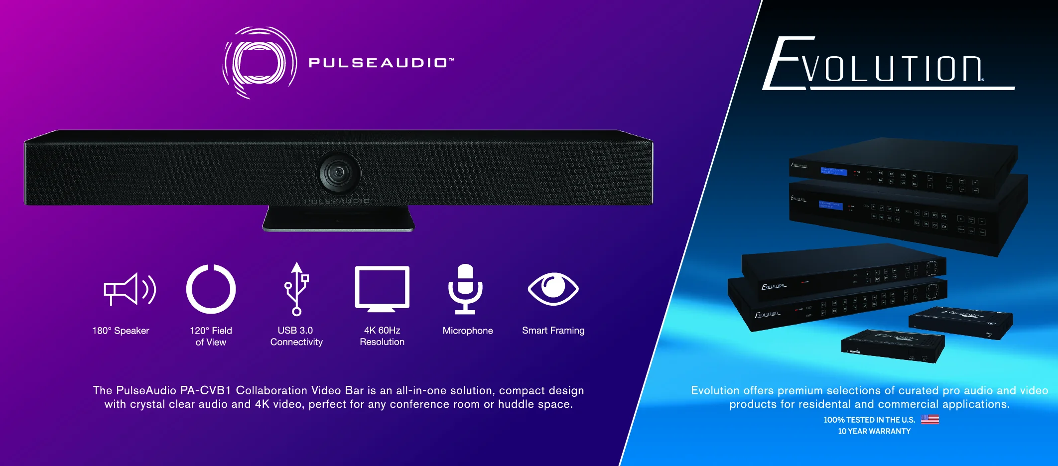
Product-information artwork combining imagery, features, specifications, and brand identifiers.
Visual record · 04
Design logic · 05
At the largest scale, the Vanco mark and blue overhead elements create the anchor. At the approach level, the entry structure, counter, and illuminated towers extend recognition. At close range, product panels and associated-brand marks give visitors material to examine. Blue concentrates attention; white preserves contrast and keeps the environment legible.
Evidence boundary · 06
The concept views show a unified visual system across overhead signage, reception, display structures, translucent towers, and information panels. The observable value is organization: identity, product story, and associated brands receive distinct roles within one environment. No performance outcome is asserted.
Project inquiry · 07
If a trade-show space needs to make a complex product line easier to recognize, navigate, and discuss, Anderson can shape the graphics, hierarchy, and connected sales material around the moments that matter.